Student Work
The task was to create two double page spreads for a print magazine by using the supplied text on David Carson. I needed to apply the principles of page architecture and typesetting and extend on my knowledge to explore more advanced and unexpected solutions.
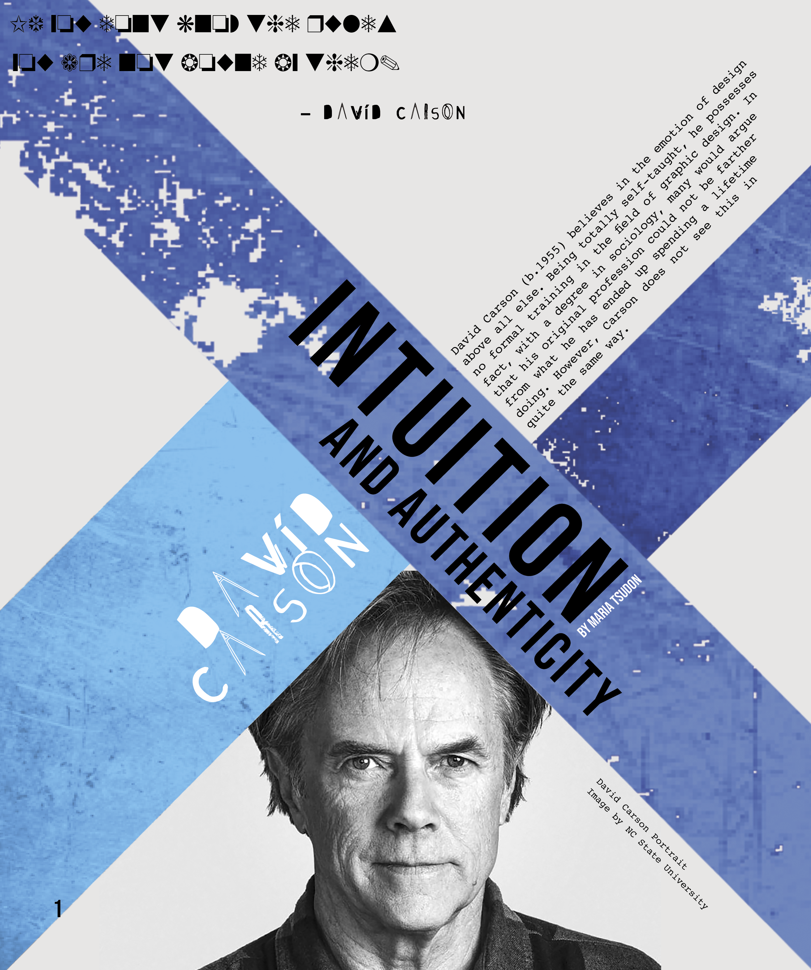
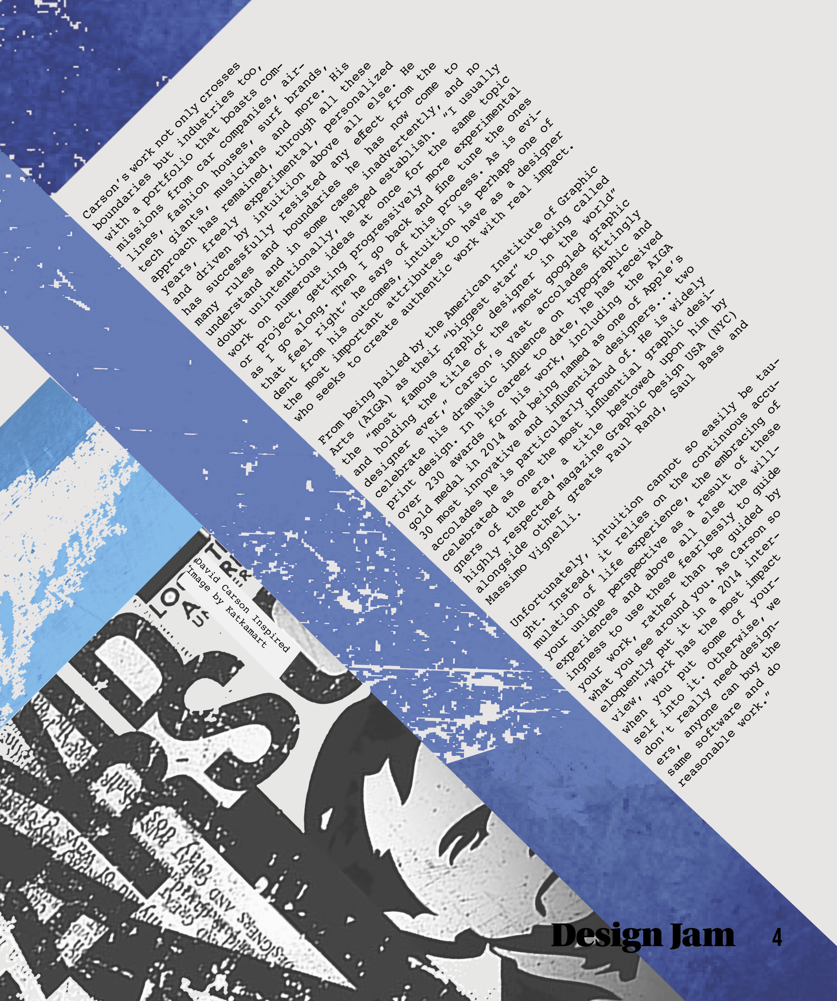
After researching David Carson and magazine design layouts, I came up with an unconventional idea that I believed would represent David Carson perfectly: Text added on an angle. Since the article was to appear in a print magazine, it would be perfectly readable as the reader could simply rotate the page to their liking.
The blues of the graphics were chosen due to Carson’s beachy, and laid-back nature, while the greyish background was chosen to add character, and to tie the entire article together. Texture has been added to the graphics via Photoshop by layering the coloured shape over an image texture, adding a blend mode, and merging the layers together. Then with the help of the magic wand tool, I removed small sections of the graphic to give it a worn look. I also created the pull quotes in ‘Zapf Dingbats’: not because Carson or the article are boring, but to add some hilarity and visual interest. These elements together created an interesting and unconventional spread that will no doubt get the readers talking.